Every presenter has been there. You open PowerPoint, browse the theme gallery, pick something that looks clean and professional, and get to work. It feels efficient. It feels safe. But by the time you are standing in front of a room or sharing your screen on a Zoom call, that “safe” choice may already be working against you.
The False Comfort of Built-In Themes
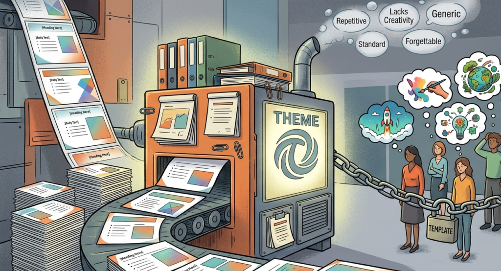
PowerPoint themes are designed for everyone, which means they are optimized for no one. Microsoft and third-party template providers build these themes to appeal to the broadest possible audience, stripping away anything too bold, too specific, or too distinctive. The result is a visual language that says nothing about your brand, your message, or your audience.
When your deck looks identical to the presentation that came before yours and the one that follows, you have already lost a critical opportunity: the chance to make your work feel intentional and yours.
How Template Dependency Shapes Lazy Thinking
Relying on a preset theme does more than affect aesthetics. It quietly shapes the structure of your thinking. Most PowerPoint templates come loaded with standard slide layouts: title slide, bullet point slide, two-column layout, closing slide. These layouts nudge presenters into filling boxes rather than building arguments.
You end up with slides that are formatted correctly but communicate poorly. Content gets forced into layouts it was never designed for. Ideas that deserve a single bold visual get buried under three sub-bullets. The template is driving the narrative, not the other way around.
The Recognition Problem
There is a practical issue too: audiences recognize popular templates. The “Ion” theme. The “Facet” theme. The “Office Theme” with its default blue accents. Viewers have seen these hundreds of times. The moment they recognize your template, the implicit message is that you prioritized speed over craft.
This is especially damaging in high-stakes contexts. Pitching to investors, presenting to a board, or selling to a new client all require you to communicate credibility and attention to detail. A recognizable stock theme signals the opposite.
What Generic Visuals Do to Your Message
Design communicates before your words do. Color choices, typography, spacing, and layout all carry meaning. When those choices are made by a template designer optimizing for mass appeal, they are not reinforcing your specific message. They are neutral at best and distracting at worst.
Original design, even simple original design, tells an audience that someone thought carefully about this presentation. That care transfers to your content. It signals that the ideas inside are worth the same level of attention.
Building a Visual Identity Instead
Breaking free from template dependency does not require hiring a designer or spending hours on every slide. It requires making a small number of deliberate choices: a consistent color palette drawn from your brand or the subject matter, one or two typefaces used with intention, and a layout logic that supports your content rather than constraining it.
Start with a blank slide, define your own master, and build from there. Even modest customization produces a deck that feels noticeably more considered than anything drawn from the standard theme gallery.
The Bottom Line
Templates exist to save time, and they accomplish that. But time saved in production is often time lost in impact. Generic decks fade from memory quickly. Distinctive, well-designed presentations stick. The goal is not to be flashy. It is to ensure that your visual choices are working as hard as your content.
The next time you reach for a preset theme, ask yourself: is this design serving my message, or is my message serving this design?